

Modals Made Easy With Tailwind CSS
Introduction
Modals are a popular way to display additional content without cluttering the main page. Traditionally, modals were created with the help of JavaScript via event handlers, click events, and/or states to toggle whether the modal should display or not. With Tailwind CSS, you can create and style modals effortlessly using the native HTML <details> and <summary> elements. This approach is not only simple but also eliminates the need for additional JavaScript.
Creating Modals with Tailwind CSS
Start by creating the basic structure of your modal using the <details> and <summary> elements. The <details> element acts as a container for your modal, while the <summary> element serves as the trigger or button to open and close the modal.
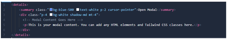
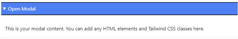
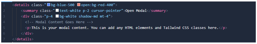
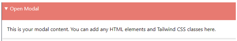
Tailwind CSS makes styling a breeze with its utility classes. You can customize the appearance of your modal by adding Tailwind classes to the <summary> and modal content. In addition, the Tailwind CSS “open” modifier can let you conditionally add styles when a <details> or <dialog> element is in an open state.
Summary
Creating and styling modals with Tailwind CSS, <details>, and <summary> elements is a straightforward process that doesn't require additional JavaScript. This approach reduces code complexity and enhances accessibility. With Tailwind CSS utility classes, you have access to a wide range of styling options, allowing you to create visually appealing modals with minimal effort.
Additional Resources