

Accessibility
Insights

Bhumika Sachdeva
Quality Assurance Consultant
Design for Web Accessibility
This blog sheds some light on how to make the user interface design and visual design elements more accessible to people with disabilities. These tips help meet the Web Content Accessibility Guidelines (WCAG) requirements.
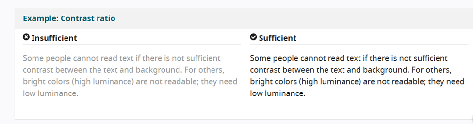
1. SUFFICIENT CONTRAST BETWEEN FOREGROUND AND BACKGROUND
The foreground text should have sufficient contrast with the background colors. A web page should have minimum Contrast by default – 4.5:1 for a normal-sized text.
Sometimes, the text is unreadable when there is no sufficient Contrast between the foreground text and the background. High Contract (dark text on a light background or bright text on a dark background) helps people with visibility impairment or aging.
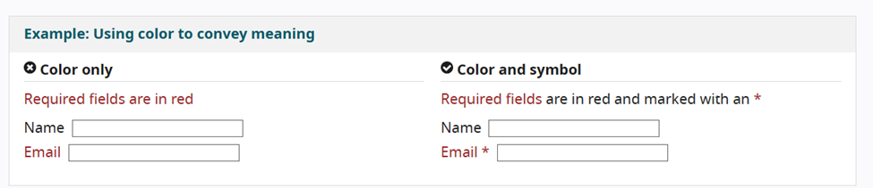
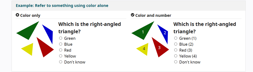
2. USING OTHER ELEMENTS TO CONVEY INFORMATION
Color is an important part of Web Design. Even though color can be used to convey information, it is not the only way to indicate an action or response. You can provide additional identification like an asterisk apart from color to indicate required form fields or use labels to differentiate areas on graphs.
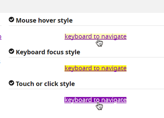
3. INTERACTIVE ELEMENTS SHOULD BE EASILY IDENTIFIABLE
Interactive elements on the Web such as links and buttons should be easily identifiable. For example, change of appearance of links on a mouse hover, or keyboard focus. Use different styles so that users can easily identify interactive elements.
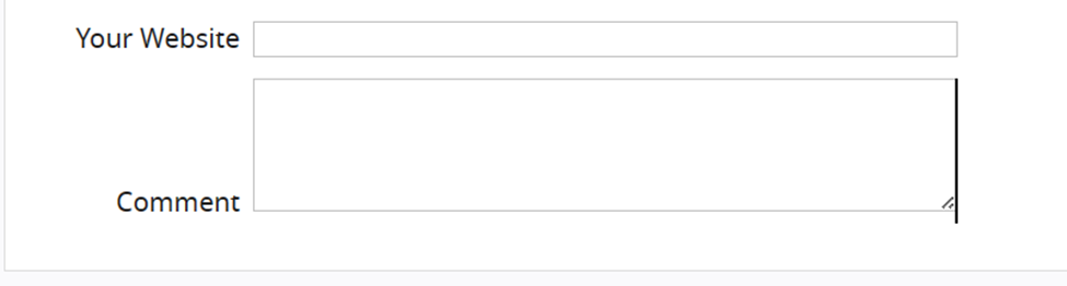
4. FORM ELEMENTS SHOULD BE CLEARLY LABELLED
All form fields should have sufficient descriptive labels. For the left-to-right languages, the labels should be placed on the left side or above the field. Checkboxes and Radio buttons are usually on the right side. Labels and Fields should not have too much space between them.
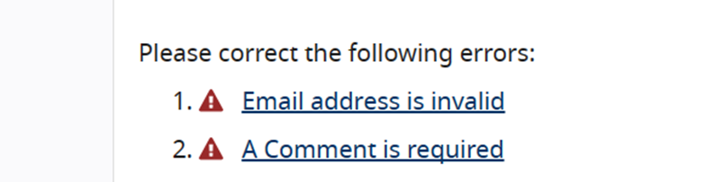
5. EASILY IDENTIFIABLE FEEDBACK INFORMATION
Provide clear feedback for interactions, for example, alerting the user when they miss important information to fill in the form. Important feedback information should be presented clearly and prominently.
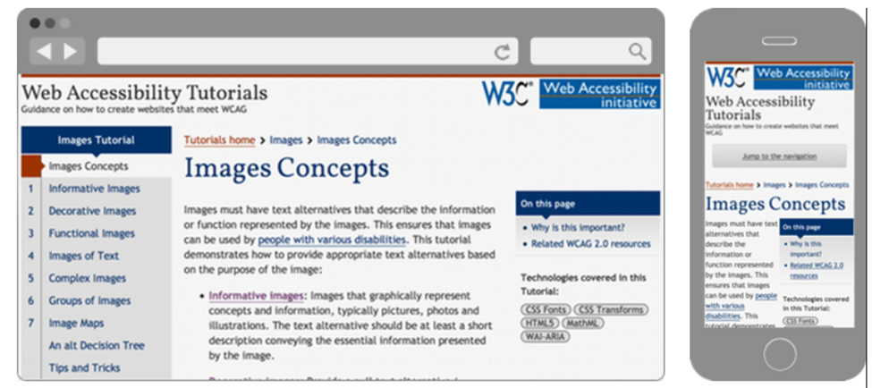
6. CREATE DESIGN FOR DIFFERENT VIEWPORTS
With different-sized view ports in the market, consider how page information will be presented on different-sized viewports like different mobile phones or zoomed browser windows. The Text and Line width should maximize readability and legibility.
Design and Develop Overview | Web Accessibility Initiative (WAI) | W3C